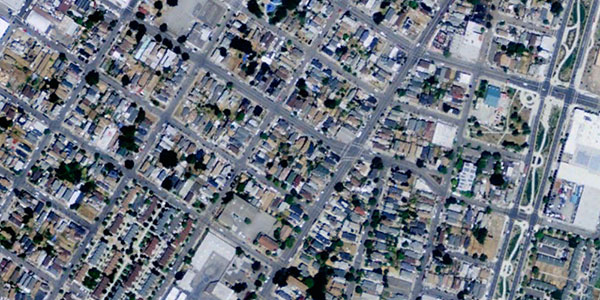
My former student Mia Renauld recently sent me a link to a great post by Tim de Chant on his blog Per Square Mile. It features side by side aerial images of poor and wealthy neighborhoods in the same city. He got the images from Google Earth and invited his readers to do the same and send in what they came up with. The result is a study in contrasts – the wealthy neighborhoods have dramatically more tree coverage than the poor neighborhoods.
I thought these paired images would be great to use in teaching environmental justice and inequality. Poor communities of color have a disproportionate burden of pollution as compared to wealthier, whiter communities. They also have fewer environmental amenities like parks, sidewalks, and the trees in these photos. See the photos from two neighborhoods in and next to Oakland below, or click on over to Tim’s post for more.
In an introductory class I might show both images without their neighborhood names and ask students to tell me which community they think is wealthier, and discuss why. Or I might ask them to go home and bring in their own side-by-side images from other places to share. Or I might just add them to a powerpoint as a visual example of environmental inequality.
West Oakland

